

Product decisions come from scattered signals and I built a graph to connect them.
I forked Garry Tan’s GBrain because I thought product managers needed a better way to write PRDs. That was partly right. It does help with PRDs, but the more useful thing was not the document. It was the memory behind the document: which customers felt the pain, where the evidence came from, what sales and support had already heard, and whether the product had tried to solve something like it before.
In a large product org, the hard part is rarely writing the artifact. The hard part is reconstructing reality from different stakeholders, roadmap review, launch decision, or customer call where the decision signals matter. PM Brain became the single source of truth acting like customer memory.
Problem: B2B PM’s signals are scattered and mostly unstructured text
A PM doesn’t make a decision from one source. They pull from customer calls, support tickets, product analytics, adoption data, sales blockers, NPS, Slack threads, prior launches, and gut instinct. Before automating any PM artifact, I asked three questions: where do PMs get the sources they use to decide, where do those decisions enter the build lifecycle, and what comes out the other side. That became the PM Brain.
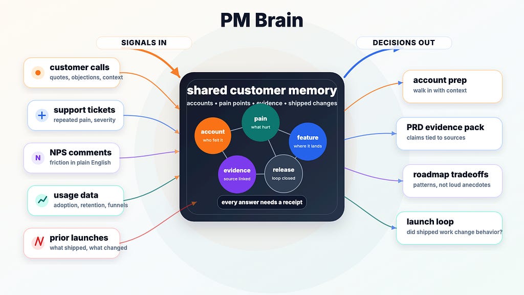
For example, sales says the UI is blocking a deal. Support sees repeated tickets. Product analytics shows low adoption in one part of the funnel. Customer calls have the quote in plain English. Feature request logs have five variations of the same ask. NPS comments have the frustration, usually with less diplomacy. Any one of those signals is easy to dismiss. Together, they are the product story.
Why I used GBrain instead of plain RAG

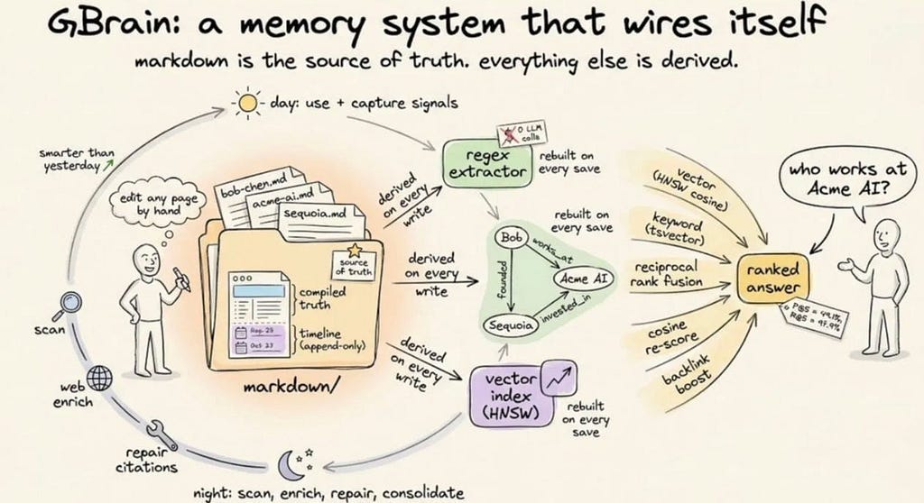
Most RAG systems are built for lookup. Embed documents, search chunks, summarize the results, hope the answer is grounded enough. That is fine when the job is “find the policy.” It is weak when the job is “explain why this customer pain keeps showing up across six systems and what we already tried.”
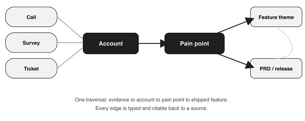
Product work is graph-shaped. Customers connect to pain points. Pain points connect to feature themes. Feature themes connect to roadmap items, PRDs, release notes, support tickets, usage patterns, blocked deals, and old decisions nobody remembers until they become expensive again.
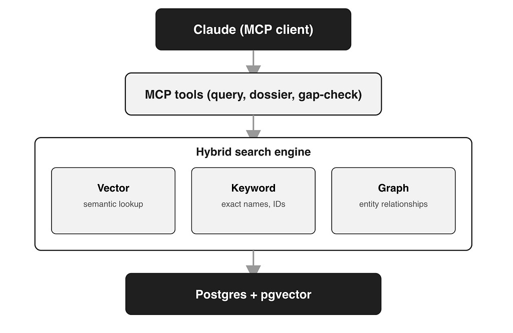
GBrain fit that shape better. Its hybrid search combines semantic search, keyword search, and graph traversal. It can cite sources and say when it does not know something. It also wires the graph on ingest without paying for an LLM call on every edge, which matters once the corpus gets large. That last part is not glamorous. It is the difference between a demo and something you can afford to keep running.
GBrain’s hybrid search runs three retrieval modes at once (vector for semantic lookup, keyword for exact names, graph for relationships), backs answers with citations, and flags what it doesn’t know instead of guessing. It also auto-wires the graph on ingest with zero LLM calls, which keeps the whole thing cheap to run at scale.
Want more practical AI workflows for product managers? Subscribe to Vibe Coding Dad.
If you want to see gbrain tutorials: GBrain shipped in April 2026 and picked up a fast following. MarkTechPost has a full install-to-MCP walkthrough with real terminal output, and Vectorize’s review is a fair-minded look at where the project holds up and where it doesn’t. Worth reading before you fork it.
The graph is grounded with accounts
I anchored on account (customer) data first, since accounts are the one object product, sales, CS, and support all share. From there I extracted pain-point themes from the qualitative data: accounts, pain points, customer asks, feature themes, product areas, and the evidence behind each one. Edges connect accounts to pain points, pain points to feature themes, and feature themes back to artifacts like PRDs and release notes.
The edges matter more than the nodes. An account links to a pain point. A pain point links to a feature theme. A feature theme links to evidence, prior artifacts, and eventually release notes. That changes the question from “find notes that mention Feature X” to “which accounts feel this pain, what did they say, which deals are blocked, and have we already shipped something related?” That is closer to the real PM question.
End users connect Claude through MCP and ask the brain directly. The prototype started as PM tooling, but it quickly escaped the PM box. PMM, account teams, and leadership all wanted different views of the same customer memory. The current graph has 100k+ pages and 225k+ edges.
The surprise use case was meeting prep
I originally built this to gather customer info, automate writing PRDs and build features grounded by customer asks. The better (and more common) use case turned out to be walking into a customer meeting prepared with customer context. That sounds obvious after the fact. Go-to-market teams talk to customers constantly, product hears a fraction of those conversations, and customers repeat the same context to sales (with turnovers), support, CS, PM, and leadership until someone finally pieces together the story.
Nobody enjoys that. Customers especially. The brain can generate an account prep note before a meeting: recent pain points, open asks, related product areas, prior conversations, evidence links, and what changed since the last touch. The PRD assistant was useful, but the account memory was valuable to more people.
The brain generates a prep note like:
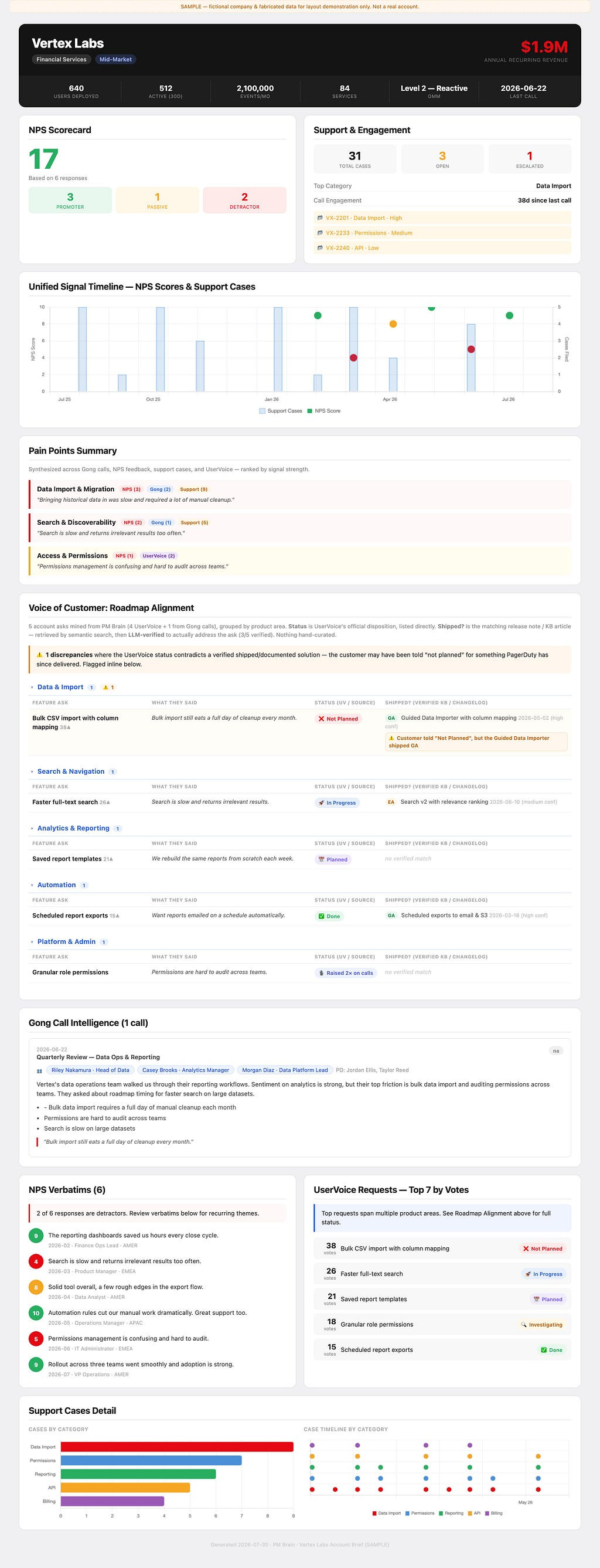
Account teams used it before calls. Partner marketing pulled pain themes. Execs used it for account prep. PMs used it to separate loud requests from patterns. The questions changed too: what should I know before this customer meeting, which pain points show up in accounts over $1M ARR, what are customers saying about onboarding friction, which product areas create the most repeated support pain, and did we already promise something related?
Keep the brain separate from the UI
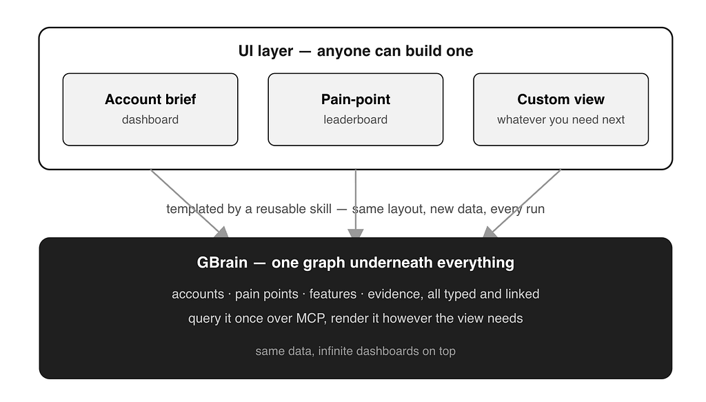
The meeting prep dossier above is not hand assembled. Account briefs run through a deterministic HTML generator with an agentic search and summarization step, so the same account produces the same brief when the data has not changed. That matters because a brief that changes on every rerun is not something you can trust in a live meeting.
The graph stays underneath as the shared memory layer. The view on top can change based on user’s preference. Today it is an account brief. Tomorrow it can be a pain point leaderboard, a launch-readiness view, a PRD evidence pack, or a product area dashboard. The important design choice is that the AI agent nor the UI does not own the memory. The graph does.
Where this goes next
The next version combines unstructured and structured data. The PM Brain has qualitative signal. The data warehouse has structured signal: usage, adoption, retention, feature telemetry. The real product is both, which means a PM can finally ask whether the customers complaining about a workflow actually show the same pain in their usage data, or whether adoption moved after a feature shipped.
Release notes are next on the ingestion list, since they close the loop end to end. Slack and email are harder. The signal is real but the noise is brutal, and ingesting them blind is how you build a haunted attic with embeddings.
The main lesson is separating the brain vs UI
As you may have heard many times: AI is not the solution, it is the vehicle that takes you to the solution. In this case AI is used two ways: building the brain, and building the customized dashboard (or PRDs / other artifacts). Once an AI agent can tab into this brain, it unlocks myriads of use cases by building any custom solutions on top of it.
You can also follow me on X for random thoughts and opinions.